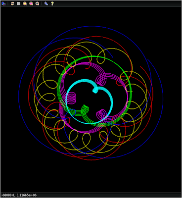
I first came up with this idea back in the Summer of 2012, documented on my Astronomy and Music blog post titled 'Feel The Noise'.
What I'm suggesting is that we begin LISTENING to our data. Our sense of hearing has a dynamic range of 1 trillion! That's 120 dB! No other human faculty is as sensitive, yet we hardly ever use it for anything other than listening to our environment.
So in this first very primitive and preliminary example, I've taken data from the JPL Horizons website to calculate the distances between the four Galilean moons as they revolve around Jupiter during the month of December 2015. Over the course of that month, I measured the distances every 5184 seconds for a total of 500, equally time-spaced samples.
This is what I call "Distance Audio".
Six distance files are created:
- Io - Europa
- Io - Ganymede
- Io - Callisto
- Europa - Ganymede
- Europa - Callisto
- Ganymede - Callisto
As you listen to this track, keep in mind that the lower tones represent smaller distances and higher tones represent larger distances.
Also, take a look at the following plot, which shows you the distances between the moons (y-axis, in kilometers) as a function of time (x-axis):
And here's a 2D version of the same data, here showing the x, y distances. The plots above are the vector sum of these distances. These are what I've been calling "Orbital Ribbons" and they are quite beautiful by themselves. Combined with the sound they make, it's pretty awesome.
Take a listen! Please note that there is a periodic popping or "helicopter" noise. This is an artifact of creating these audio files which I can hopefully eliminate once I understand the process better. For now, please put up with it!
Click to Listen to 'Jupiter Moon Distances'
This is only the tip of the iceberg! Any kind of data can be turned into music!
So then I took a random image of M13 from the Sloan Digital Sky Survey:
and then I blurred it a little...
and then I blurred it a little more.
I then took the pixel values (representing intensity) along a column going right through the brightest part of the cluster (near the left edge) and translated those to audio frequencies for each of the three images. A higher tone represents a brighter pixel. I then mixed those into a single track and this is what I got:
This is called "Visual Audio"
A Slice Through M13
And finally, here are the first five lines of the hydrogen Balmer series, converted from nanometers to Hertz, and mixed into a single five second track. This can be done for any spectrum and I'm anxious to listen to the spectrum of our sun, other stars, galaxies, etc.
This is called "Spectral Audio"
Hydrogen Balmer Series
More to Come!
This is a new form of data analysis that needs to be explored! Yes, it can create some interesting and possibly "pretty" sounds, but there is very useful information in those sounds that contains information about the data that might be overlooked!


No comments:
Post a Comment